EVERYONE TAKES A BAD PHOTO
THE COSPLAYER/PHOTOGRAPHER RELATIONSHIP
AMBER LOVE 11-MAY-2015 There are probably millions of “How To” blog posts out there regarding making and modeling in Cosplay. I’m not going to rehash what other people have already covered. First off, I’m not a photographer. I can say things like “lighting makes a big huge difference,” but I can’t tell you how to accomplish that. Ask a photographer. Here, I’m going to show a photo essay of things I look at as someone who has been in costuming since 2006 and been a model since 2009. I’ve put this in with my Tutorials because photographing is part of the modeling process a lot of the time (and I even examples below of modeling for sketches not photos).
This post includes me at all different weights and skill levels including comfortability, confidence, body size, how the costumes came out, and real examples of things I love or hate. None of it is a reflection on the photographers’ skills except where noted specifically. I’ve wanted to do that for a long time, but it was a particular experience at this year’s Free Comic Book Day that I thought about it more.
I showed some really devastating examples of good vs. bad cosplay images while I was making my Madame Web costume last year. Below you’ll find a variety of costumes and situations with examples of good and bad images.
COSPLAY MODELING
For FCBD at Comic Fusion, we are extremely fortunate that a photographer comes from about an hour away to donate his time at the event and doing some post-production. That’s JFCP or Jim Fogarty Cosplay Photography. Jim usually comes to our annual charity fundraiser which is two days, the first weekend of October.
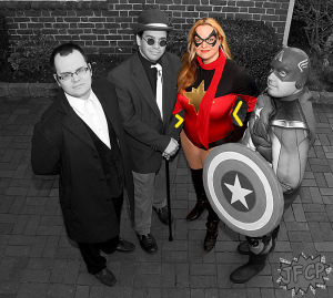
In Image 1 (above), I made some color notations to show why I love this photo. There were a lot of photos from FCBD that I hated and Jim subsequently deleted (more about that below). The image above has the right shadow casting so you can see that my breasts have shape and not only an expanded width in the sea of red spandex. Where I drew in the yellow arrows, that’s where this shot shows I have curves inward at my waist which is important for my shape because it’s not always visible – it depends on the shot. My hips/butt look proportionate to my chest and waist. You can see that I have thighs yet they have no unnecessary focus to the shot. The costume fabric has a nice shine to it. The color saturation is fine. The contrast isn’t overly posterized as I’ve seen in a lot of pics. Finally, my double chin is not grossly obvious.
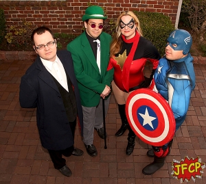
The only thing that could have used some improvement in regards to me in Image 1, is that my scarf end is accidentally tucked under the Riddler’s arm so it looks like my arm is somehow flattened and badly photoshopped. It’s just the scarf though. Below is what the final image looks like from JFCP.
MONOCHROME OUTFITS
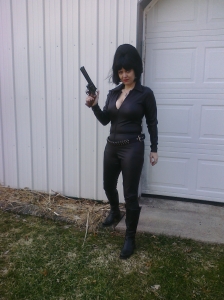
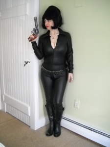
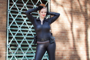
Shooting a single color outfit can impose its own challenges. When I wear a full catsuit in all black, it’s not suddenly flattering because it’s black. Not by a long shot! In fact, there are plenty of black catsuit pictures of myself that I think I look like a whale because of the color, texture, my shape, and the shot. A skilled photographer can work with this and still get a great photo series.
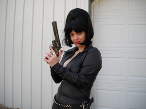
In Image 2, I was a lot thinner than I am now, but compared to Image 3, you’ll see what happens because of harsh body shaper elastics, an unskilled person with a point & shoot camera, and posture.
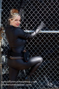
Now take a look at the subtle changes of the posture/pose and then moving to indoors. All shot the same day by the same person with the same camera. Image 3 shows cropping makes a huge difference in one case – it immediately lessens the biggest areas of concern but the belly rolls are still visible, so it’s not perfect, but it’s better.
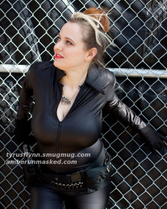
Now go even further and look (below) at what a professional photographer can do in natural lighting. Images 5-7 were shot by Tyrus Flynn at New York Comic Con in 2011, roughly the same time as the others above. And to top it off, I was in tremendous pain! I had thrown my back out the week of the convention. I was taking whatever I could find in order to stand up let alone try and walk, climb and pose. Tyrus was incredibly kind and patient and did whatever he could to help me. He never made me climb on anything else, that was all me trying to be better because I wanted great shots. I had the same “problems” with my waistline rolls, but the final shots made me feel better about them not being as visible as the pre-con photos. Plus, working with Tyrus is a happy experience!
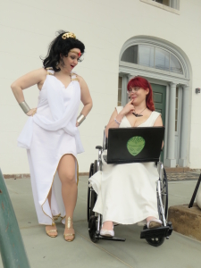
Here’s a completely different costume but has the same challenge of monochromatic scheme. It’s the Adam Hughes inspired Grecian Wonder Woman gown that I made in 2014 and wore for Comic Fusion’s FCBD that year. I love the Hughes design, but the construction had problems which I explained every problem in my tutorial for that gown. I could not possibly wear something as low cut as his poster. I need to wear bras and shapers with clothes. The shapers caused a problem with how much of the back was supposed to be exposed. I made a couple pieces of rectangles that I attached to mask it, which I hated, but did the job. Without them, the back of gown is quite pretty, yet unwearable for me. The clasps I used on the shoulder area were uncomfortable and cut up my skin so I was having a hard time with that, particularly on the left side where it scratched enough to bleed. And then of course, the shoes – ugh – I hate wearing heels anymore. I cannot walk in them like I used to. We walked about a mile to get some photos and while they came out excellent, it was a painful experience.
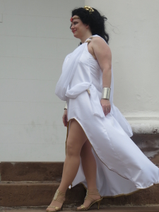
In Image 8, you can see there was a wonderful breeze which carried the gown back and produced a lovely effect. I typically hate the size of my upper arms (aging problems suck), but here it isn’t that bad. You can also see that the white is two different types of fabric which create subtle changes in texture so they don’t blend into each other as a giant amorphous white blob. And just behind my arm, you can actually see that I have a curve showing my waist to butt curve in a not obvious way. Also, my legs look good. These pics were shot on cell phones and point and shoot cameras.
The same basic things apply for Image 9. The white on white is clearly visible. The pose – hands on hips – helps to show that there is a curvature in my waist which can be quite hard to see if the angle isn’t flattering. The high cut of the dress and good quality suntan color tights make my legs look decent. I bring up the tights on purpose here because in Image 10 from the 2015 FCBD, the tights got bunched up around my knees and makes for a bad photo composition.
EXAMPLES OF THE BAD
All of the things I loved and pointed out in Image 1 are completely wrong in the images below. I explained why in great detail.
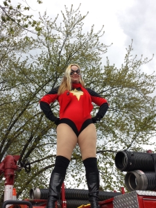
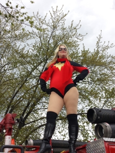
Images 10 and 11 are from a series we shot this year at FCBD while I was standing on top of the fire truck. It’s the same day, same outfit as seen in Image 1, but you can see the difference in why this is a bad photo. Image 10 is a terrible angle to start with. Shooting upward is NOT flattering unless you are dealing with perfectly bodied models and/or excellent photography skills. You can’t simply point up, frame it nicely, and think the ending shot will look good. It won’t.
This series shows big problems and little problems. The tights are too bunched up around my knees. The scarf’s tag is showing. The angle doesn’t show that I have a waist at all. It’s shooting directly at my thighs making them look enormous, especially in Image 11. And my double chin is way too pronounced by the angle and shadow.
These were shot by my friend Jesse with my cell phone. Jim (of JFCP) took a lot too but because I objected to most of them, he deleted the ones I hated with a passion. It was all thigh and neck and simply disgusting for me to look at. You don’t notice the quality of the costume at all in bad shots like this.
The solution: Change the pose. Crop the photo. Or move to a better angle that’s not so severe. Image 12 is an example of changing everything but the costume and capturing a better photo and it’s a simple quasi-candid shot.
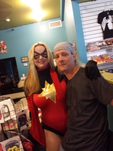
FIGURE MODELING – CAN’T HIDE ANYTHING
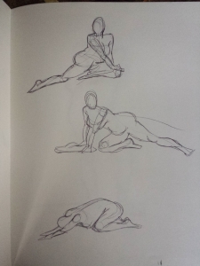
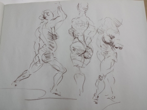
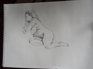
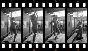
Sometimes you don’t even know you have curves until you seen yourself through someone else’s eyes. That’s one of the things I love about modeling naked. The artists and photographers have to be excellent at what they do and I have absolutely nothing to adjust how I look. It is all real and can create some of my favorite images. Image 13 is a figure example shot with my cell phone. No professional lighting or anything.
Artists can, of course, make things “prettier” in whatever definition of beauty they want – they can remove my double chin, my belly fat, they don’t draw cellulite (which even very thin women have); and when they know what they’re doing, shadows work for them, not against them. See Images 14-17. Some artists, like John Powers, show emphasis on every curvy blip and shadow and still produce lovely pieces of art; others give a sleekness where I may not even have any grace at all and they still create beautiful images.
CORSETS!
Let’s not forget the power of corsets. They honestly do not solve every problem. They are very challenging to move around in which makes posing quite difficult. And on someone like me, the torso length fit is a huge challenge too – if I sit, forget it, the corset will crunch upward and jam my ribs and breasts. Sometimes that makes for a great photo if you’re angling down at my chest (Image 18), but it can also make me look awful if you’re on the same level and shooting directly at my side. Even in a shot that I consider good because all you see is cleavage – I can pick out flaws like boobmuffintop. Image 18 is a simple selfie at a convention and my current phone removes a LOT of the redness in my skin (if you follow my tweets, you’ve seen me complain about how I’m basically a pale Dalmatian).
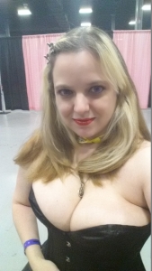
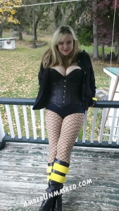
Image 19Â shows another example of a decent corset shot. This time the boobs aren’t all in the viewer’s face. The pose is all about elongating my figure. It’s a fun, casual shot. That doesn’t mean it was easy. I was leaning carefully on a railing and with all those layers of nylon + the steel corset, it was very hard to move. My butt was not resting on the railing. I had to rely on my flimsy weak arms to lean back for this shot.
Good luck! Meet lovely, kind photographers and artists! And enjoy the cosplay experience to its fullest without mourning over the fact that you hate some of the photos. Everyone will hate some of their photos. Trust me on that.
6 Comments on Everyone takes a bad photo. Things that I look at as a model & #cosplayer. Some #nsfw
Comments are closed.



I’ve never liked the photos I’m in. A friend suggested that I keep my head down a little bit, and that helped quite a bit.
This is a great tutorial, and maybe I have a little more confidence now to take the jump into cosplay.
Cosplay should be for everyone, but I admit, it’s a lot harder for me personally when I see how many people actually do look like they leapt right off the Hollywood screen.
HOW DARE YOU CRITICIZE MY COMPLETELY UNTRAINED PHOTOGRAPHY SKILLS! :p
All joking aside, I’m sorry those shots came out as poorly as they did.
It’s not because they were “your” shots. Jim took plenty also but he deleted them because they were bad. The ones I have to make my point are the ones from my camera. Having Jim as a professional isn’t a complete formula. The angle is terrible and I told him that. That’s why nearly every selfie you see of a woman is from above not below shooting up.
I don’t care about the dos and donts. But you look hot girl. In and out of cosplay. Damn where can we see more of you.?? Email me
Thank you – at the moment, you can only see pics here and at Cosplay Deviants (links in my menu). I don’t even know if I’ll go to Exxxotica this year. I may try a different show. I’ll be around NYCC but not at a booth. I haven’t been asked to work at a booth in a while. I’m usually covering panels for the Vodka O’Clock podcast.
-Amber